By Ella Rockawin
Visual Communication Design
Dickson College - Year 12
I have designed a magazine cover and double page spread for a design magazine called 'Elevated Design'. The focal point of the front cover is the photograph, which shows a large plant in front of a brick wall. To the left of the photograph is the masthead which is positioned vertically. This compliments the horizontal lines in the brick. The use of three lines for the ‘E’s gives a sense of elevation, reinforcing the name of the magazine.
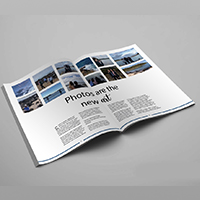
Similarly to the cover, the double page spread focuses on the photographs. The 12 photographs used all share the same colour scheme. The title of the article is centred, with a simple font used. A more creative font was used for the word ‘art’ to emphasise it. The body text is split into four columns so that the information is easy to read. Finally, the horizontal blue line at the bottom of the page connects with the blue photographs, creating unity.